campaign design
I thoroughly enjoy the challenge of crafting cohesive visual systems that not only draw a potential consumer’s attention but are also capable of driving a message across multiple platforms. Whether it’s launching a new product, promoting an event, or raising awareness for a cause, I aim to create campaigns that are both visually compelling and strategically effective.
What excites me most about campaign design is its collaborative and dynamic nature. It requires not just creativity, but also the ability to adapt, iterate, and problem-solve within constraints such as timelines, budgets, and brand guidelines. Through these projects, I have learned how to balance big-picture thinking with design precision, with the end goal of delivering campaigns that resonate, engage, and perform.
better bowl campaign
Role
Graphic Designer
Company
Better Bowl
logo & brand guidelines
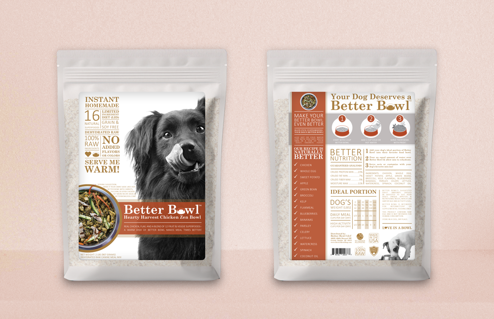
This campaign began with building the brand from the ground up, starting with the logo. As a small marketing team at HelloLife, we collaborated closely to develop a visual identity that felt approachable, friendly, and emphasized the product’s all-natural qualities. With intentionality, we chose a classic serif typeface to evoke trust and friendliness, and incorporated a dog bowl image into the typography to create a clean, memorable logo mark.

From there, we crafted branding guidelines and the official Better Bowl color palette.
Our first venture with the newly created branding was to design the packaging for the product, namely chicken and vegetable flavored formulations. Our desire was the keep the design clean and minimalistic. Despite the large amounts of information that needed to be included, I was able to come up with an eye-catching layout that accommodated it all.
packaging

print advertising
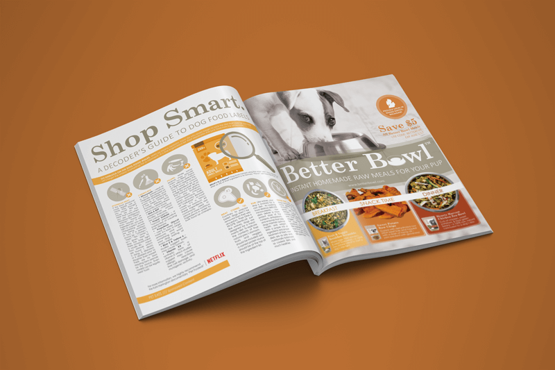
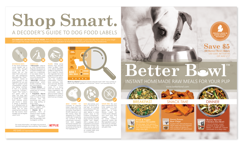
One of our earliest and most impactful print efforts was a full-spread, center-page ad in Revue Magazine, a well-known publication in Grand Rapids, MI. This high-visibility placement allowed us to directly reach our target audience and played a pivotal role in generating our very first sales. The exposure helped validate our brand and marked a key point in our launch.
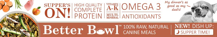
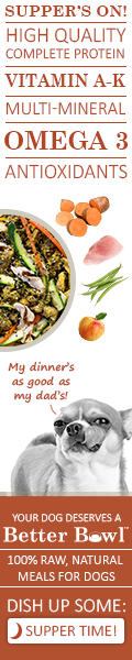
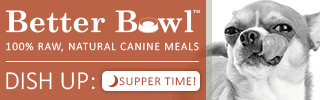
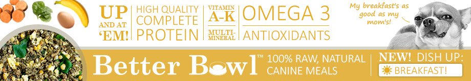
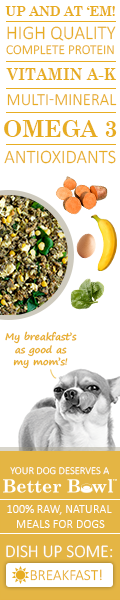
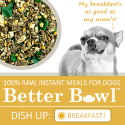
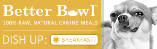
google ads
Our digital advertising goals were clear: drive traffic to the website, increase sales, and build brand awareness. We crafted ad copy specifically to resonate with dog owners looking for a healthier, all-natural alternative to traditional dry or wet food. Using this messaging as a foundation, I designed a full set of standard-sized Google ads. It was a rewarding challenge to bring our new branding to life across such a wide variety of formats, especially within the limitations of narrow, highly constrained dimensions.
Immediately below is an example of how these Google ads appeared in context.
Below is a sampling of the ads. Not all that were created are included.


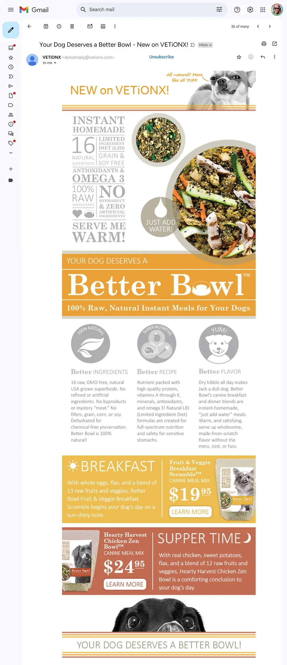
email campaign
While designing the Google ads above, our team also launched Better Bowl’s first email campaign. We targeted the existing customer base of Vetionx, our parent company, and a trusted wellness brand for pets. Since these customers were already familiar with all-natural products, our goal was to introduce Better Bowl as a fresh and playful. To distinguish it from the Vetionx brand, we leaned into lighthearted humor and highlighted the fun, satisfying experience of adding water to the dehydrated food and watching it come to life.

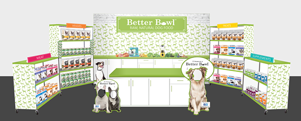
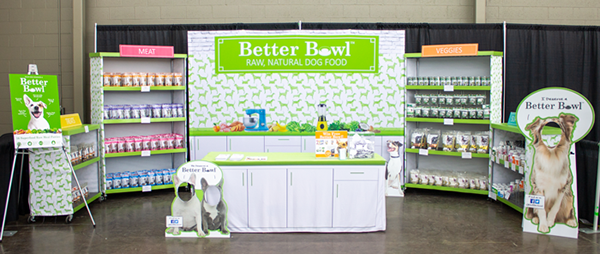
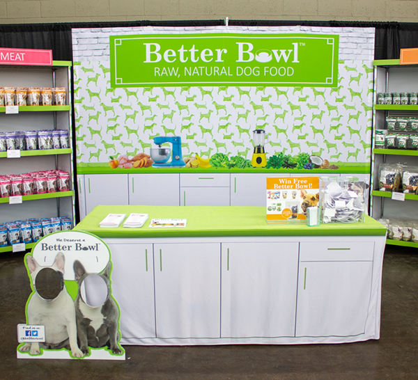
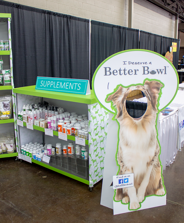
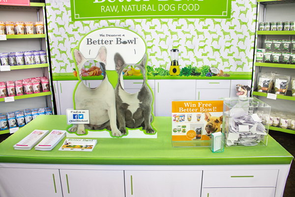
expo display
After gaining initial traction with sales, it was time for Better Bowl to connect with customers face-to-face. The expo display was a collaborative effort between the copywriter and me, designed to be eye-catching, colorful, and interactive to attract visitors on the show floor. With only one month to complete the entire project, including design, printing, and on-site assembly, we worked under tight deadlines. As a small team, we handled everything ourselves, assembling the display on-site. I led the design process from start to finish, including prepress preparation and direct coordination with the print vendor to ensure everything was production-ready. Despite the time constraints, the project came together seamlessly and made a strong impression at the event, with visitors commenting on the simplicity and colorfulness of the design.
I created the Photoshop mockup below to guide as we created every detail of the display.